Physical Address
304 North Cardinal St.
Dorchester Center, MA 02124
Physical Address
304 North Cardinal St.
Dorchester Center, MA 02124

The new rules aren’t the only thing changing in this year’s Formula One season. The start of the new season means the unveiling of new f1 liveries. Here is my personal ranking of the designs this year.
At number 1, we have Mercedes-AMG Petronas Formula One Team. The 2025 livery stayed true to Mercedes’ heritage with its iconic silver base and clean black accents. It was elegant and instantly recognizable, but it did play things a bit safe with simple transitions and a minimal overall design. In 2026, Mercedes refined that foundation by adding smoother color transitions and more dynamic elements, giving the car greater depth and presence on track. It kept the classic identity while feeling more modern and bold. I may be a bit biased since Mercedes is my favorite team, but the evolution from 2025 to 2026 is exactly why they take the number 1 spot for me.
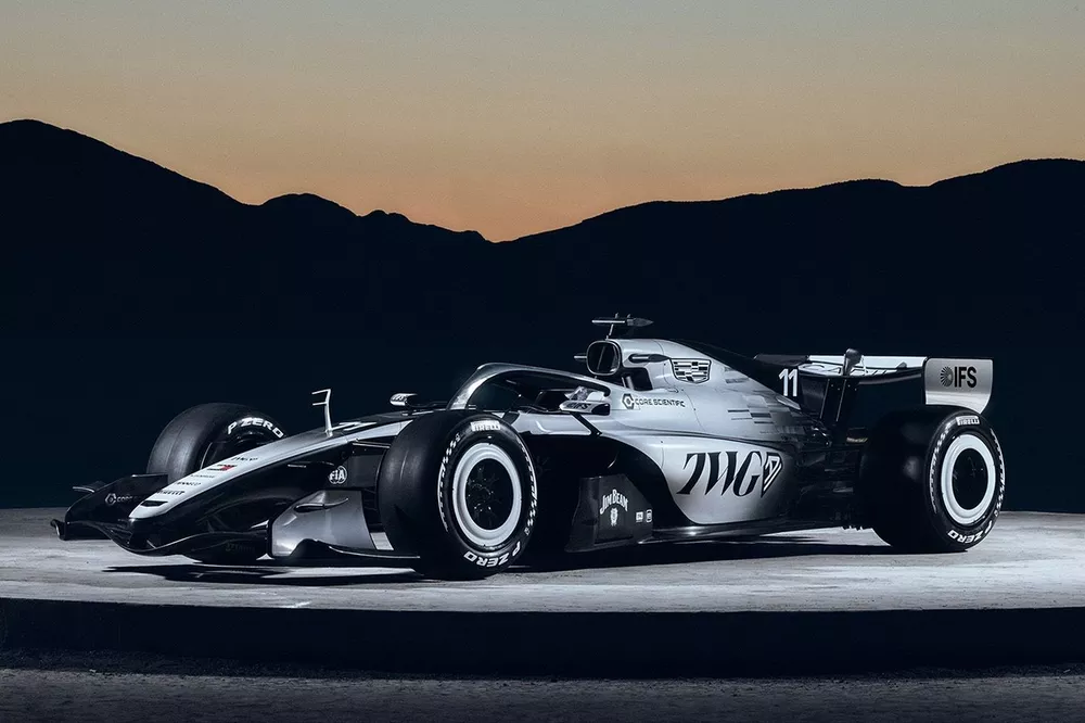
At number 2, we have Cadillac. Cadillac absolutely delivered with their livery in their debut year, immediately standing out as one of the strongest designs on the grid. The color scheme feels bold and intentional, perfectly matching Cadillac’s luxury and performance image while still fitting into Formula 1’s modern aesthetic.
The design is clean without being boring, and every element feels well thought out rather than rushed. For a first-year team, Cadillac set the bar high, proving that new entries can make a strong visual statement right away. If this livery is any indication of their approach, they look ready to compete both on the track and in terms of brand presence from day one.
At number 3, we have Red Bull Racing. The 2025 livery stuck closely to the team’s long-established identity, with the deep navy base, bold red and yellow charging bull, and minimal changes overall. It was aggressive and instantly recognizable, but it felt very familiar, almost unchanged, which made it a bit predictable compared to other teams experimenting with new design elements. In 2026, Red Bull kept the core concept but introduced subtle refinements that made the car feel fresher. The color tones appeared slightly richer, and the placement of accents and sponsor logos felt more integrated into the bodywork rather than simply laid on top. While it still wasn’t a dramatic redesign, the small adjustments gave the livery a cleaner and more polished look. It may not be the most revolutionary design on the grid, but its consistency and strong brand identity are why it earns third place on my list.
Up next is Williams Racing’s 2025 and 2026 liveries show how the team is changing while still staying true to its roots. The 2025 livery focuses on a cleaner and more refined look, using a smooth gradient from dark navy to a brighter Atlassian blue. This design feels safe and professional, representing stability as the team continued rebuilding. The 2026 livery, however, is much bolder, with a brighter blue finish and strong black and white accents that make the car stand out more on track. The addition of a subtle red-and-white detail also pays tribute to Williams’ past success, showing confidence as the team moves into a new era.
At number 5, we have the Haas F1 Team. The 2025 livery leaned heavily into the team’s American identity, featuring a bold mix of white, black, and red. It was clean and straightforward, but at times it felt a little flat, with large, solid color blocks and minimal detailing to add depth. While it wasn’t a bad design, it didn’t fully stand out on a crowded grid. In 2026, Haas refined the concept by improving the balance between the three colors and making the transitions feel smoother and more intentional. The layout looked more cohesive, and the added detailing gave the car a sharper, more competitive presence. It still kept the strong American theme, but the execution felt more polished. Overall, the step forward from 2025 to 2026 is why Haas lands at number 5 on my list
At number six, we have Aston Martin. I really like the livery, especially because of the iconic green; it’s one of the best colors on the grid and always looks clean on track. The shade of green still gives the car that classic Aston Martin identity, and overall, it’s a solid design. However, I don’t think it’s quite as strong as the one from the year prior. Last year’s version felt a little more polished and balanced, whereas this one doesn’t hit the same visually. It’s still a good-looking car, just not a step forward compared to what they had before.
At number seven, we have McLaren. The livery is still strong overall, especially with the signature papaya orange that makes the car instantly recognizable on track. The black and orange combination continues to work really well and gives the car a sharp, aggressive look that fits McLaren’s racing identity perfectly. It’s clean, modern, and easy to spot during a race, which is always a plus. That being said, compared to some of the other liveries this year, it doesn’t feel like a major upgrade. It sticks closely to what they’ve done recently, which keeps the brand consistent but also makes it feel a little safe. I was hoping for a slightly bigger design risk or a new detail that would make it stand out even more. Overall, it’s still a solid livery, just not one that really surprised me.
At number eight, we have Racing Bulls. I actually really like the new livery and think they did a better job compared to last year. The design feels cleaner and more put-together, and the color combination stands out well on track. It looks more confident and intentional, which is an improvement from the previous version. That being said, even though it’s better than last year, it just isn’t as strong as the teams I ranked ahead of it. It’s a solid design and definitely a step in the right direction, but it doesn’t quite reach that top-tier level. Overall, it’s improved and respectable, just not one of my absolute favorites.
At number ten, we have Alpine. From what I can see, the livery is almost identical to the previous year’s design. There aren’t any major changes or bold new elements, which makes it feel a little repetitive. However, even though it didn’t really evolve, the design still works. The blue and pink looks clean on track, and the overall layout is balanced and easy on the eyes. It may not be exciting or groundbreaking, but it’s still a nice-looking car. Sometimes sticking with what works isn’t a bad thing; it just doesn’t make a big statement compared to some of the other teams this season.
At number 10, we have Scuderia Ferrari. The 2025 livery stayed true to Ferrari’s iconic red, delivering a classic and clean look that honored the team’s legacy. While it was instantly recognizable, the design felt very safe, with minimal experimentation in graphics or color transitions, making it blend in rather than stand out on the grid. In 2026, Ferrari made subtle refinements, slightly adjusting the shade of red and reworking some accent areas to add a bit more contrast and sharpness. The improvements helped modernize the car without losing the classic Ferrari identity. Despite the tweaks, it still isn’t as bold or striking as some of the other teams’ liveries, which is why Ferrari lands at number 10 on my list.
At number 10, we have Audi. I believe Audi had a real opportunity to do something special with their livery design, but that opportunity was mostly wasted. The design isn’t terrible, but it feels very basic and underwhelming for a brand making its debut in Formula 1.
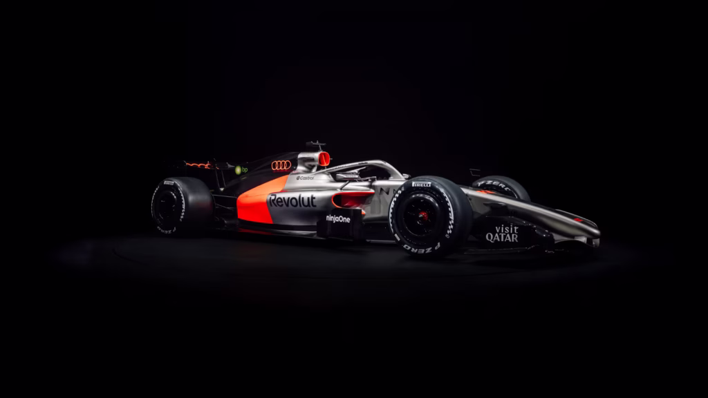
The biggest issue is the lack of a smooth transition between the red and grey, which makes the livery feel abrupt and unfinished. I think the car would have looked much better with a gradient to blend the colors more naturally. Since this is Audi’s first year, they deserve some slack, but hopefully they deliver a more creative and refined livery next season.